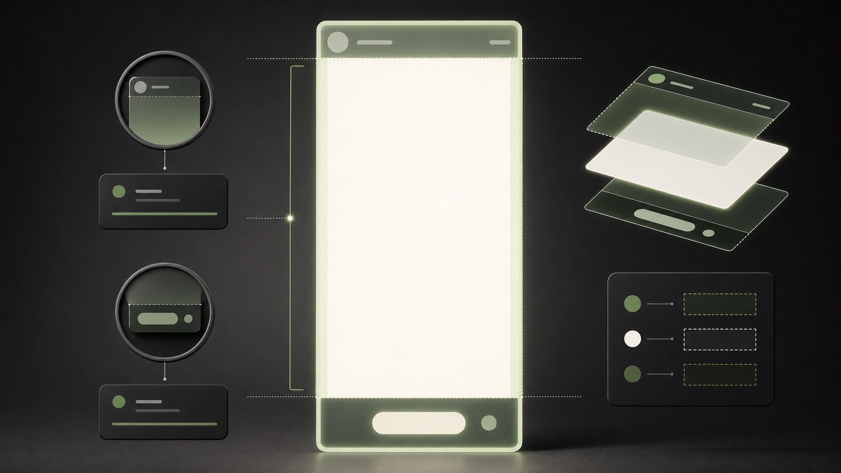
A Story ad is not simply a feed image made taller. The placement includes account and navigation elements plus a call-to-action treatment near the lower portion of the screen. A disciplined safe-zone layout gives the product, message, and action room to work without relying on guessed pixel coordinates that may change across devices.
VISUAL LESSON
What you will learn
- 01Map content into safe, caution, and overlay zones.
- 02Create a short Story message hierarchy.
- 03Preview and correct the ad across representative devices.
ILLUSTRATIVE WORKED EXAMPLE
Allocate attention before adding decoration
PRACTICAL INTERFACE MAP
Build and inspect the Story placement
Use the current Story aspect-ratio guidance and keep the essential subject away from likely interface zones.
Make the opening frame understandable without sound and leave clear space around the platform CTA treatment.
Use the current placement preview to check crop, overlays, captions, motion, contrast, and destination consistency.
STEP-BY-STEP LESSON
Overlay map → message hierarchy → placement preview
THE LEAD ATLAS METHOD
Lead Atlas Data can supply business contacts researched for the same location, category, and campaign audience when you want a precise outreach channel beside paid social.See how custom list research works ↗Define the one-screen job
Choose one audience, one problem, one supportable promise, and one next action. A Story disappears quickly, so several competing headlines usually weaken comprehension rather than add persuasion.
Write a silent-view version first: subject, short message, proof cue if needed, and action. Sound can strengthen the idea but should not carry essential meaning alone.
Draw three layout zones
Mark the top and bottom as overlay caution areas and protect a central safe field for the focal subject and core message. Use current placement guidance and previews rather than assuming a permanent universal pixel boundary.
Keep faces, product details, required qualifiers, and essential copy away from edges. Reserve visual breathing room near the call-to-action treatment instead of placing a competing button behind it.
Build the message hierarchy
The first frame should establish context immediately. Use contrast, scale, and motion to lead from subject to promise and then toward the action; do not rely on a paragraph of small text.
If a disclaimer is required, make it readable and give it enough time on screen. When the necessary qualification cannot fit honestly, simplify the claim rather than shrinking the text.
Preview the complete experience
Inspect placement previews for crop, overlay collision, caption position, animation timing, and CTA competition. Then open the destination on mobile and confirm that it continues the same promise.
Review light and dark backgrounds, representative devices, and sound-off playback. Correct the master asset instead of accepting a weak automatic crop when the focal point moves out of the safe field.
Create a Story preflight
Have a reviewer answer three questions after one viewing: what is offered, why it matters, and what to do next. If the answers conflict, revise the hierarchy before spending.
Deliverable: vertical master, overlay-zone map, silent storyboard, claim source, CTA clearance check, placement previews, mobile destination test, and reviewer notes.
THE TAKEAWAY
Design from the overlay zones inward: protect the focal point and core message, reserve space for the platform action, and test the actual placement preview before launch.OFFICIAL REFERENCES